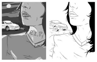
My initial rough sketch and inked drawing.

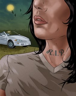
The final version. Regarding the surface treatments , and the tonal rendering , it's a bit of a departure for me.

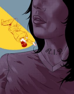
Finished up this piece early , so I went back and started playing with some of the elements and came up with another version which was more graphic , and flat, with a tip of the hat to those 50's trashy crime novels. Enjoy!


6 comments:
Great pieces. Thanks for sharing the process ;)
I agree, the final one is much more attractive and stylish.
Hey, thanks for stopping by. Glad you like the work.
Dom, is that a digital sketch?
I like both finals but there's something about the first that is very pleasing texture wise. Have to hook up soon :)
Take care
Yup, the sketch is def digital. While it has its advantages , digtal sketching can lack the warmth of a traditional pencil one. Sometimes I just find it quicker.
Thanks for stopping by. TTYSoon
Nice work, Hombre.
Hey - that car looks familiar! :)
Thanks man.
Do you mean the car in the Mar 7th posting ? if so , you're correct, it's Carter's ;)
Cheers, Dom
Post a Comment